


Case study
Brego
Tally has over a million users all over India using their software on different types of computers and operating systems. Some of its users still use Pentium processors and even lack GPUs for their day-to-day tasks. To accommodate them, Tally creators opted to use very basic 8-bit graphics in their programs to maintain consistency and familiarity across all platforms.
The data available is represented as tables and raw numbers. Traditionally, an accountant would always have to be present to translate this data and address the questions and concerns raised by business owners or managers.
Brego was born to fill this gap.
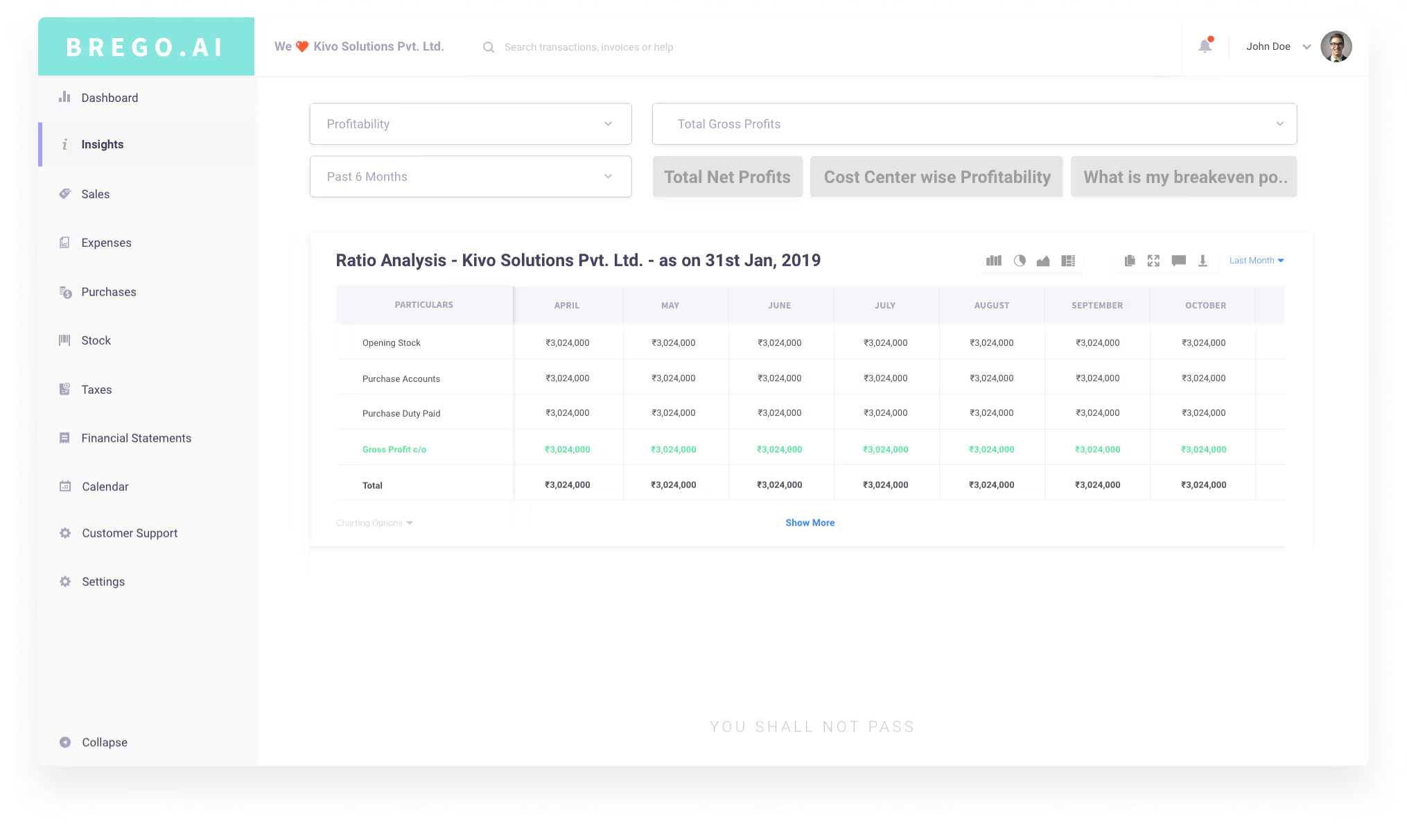
Query Sorting
Once the major data was segregated, the next step was to structure that data to design a system that could help users find the relevant data with the least number of clicks possible.
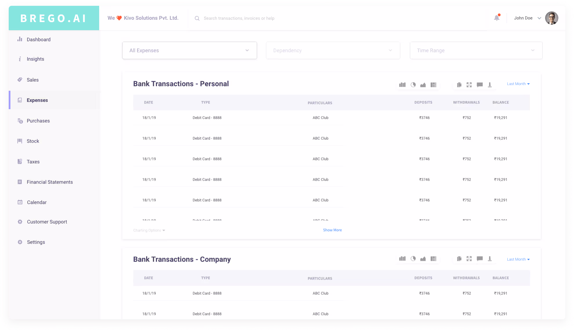
Filter-Based System
Upon observing the set of questions asked by stakeholders, we could split most of the queries into three definitive parts: the Query, Location, and Time Period, which essentially filter the content as a user navigates through the flow.
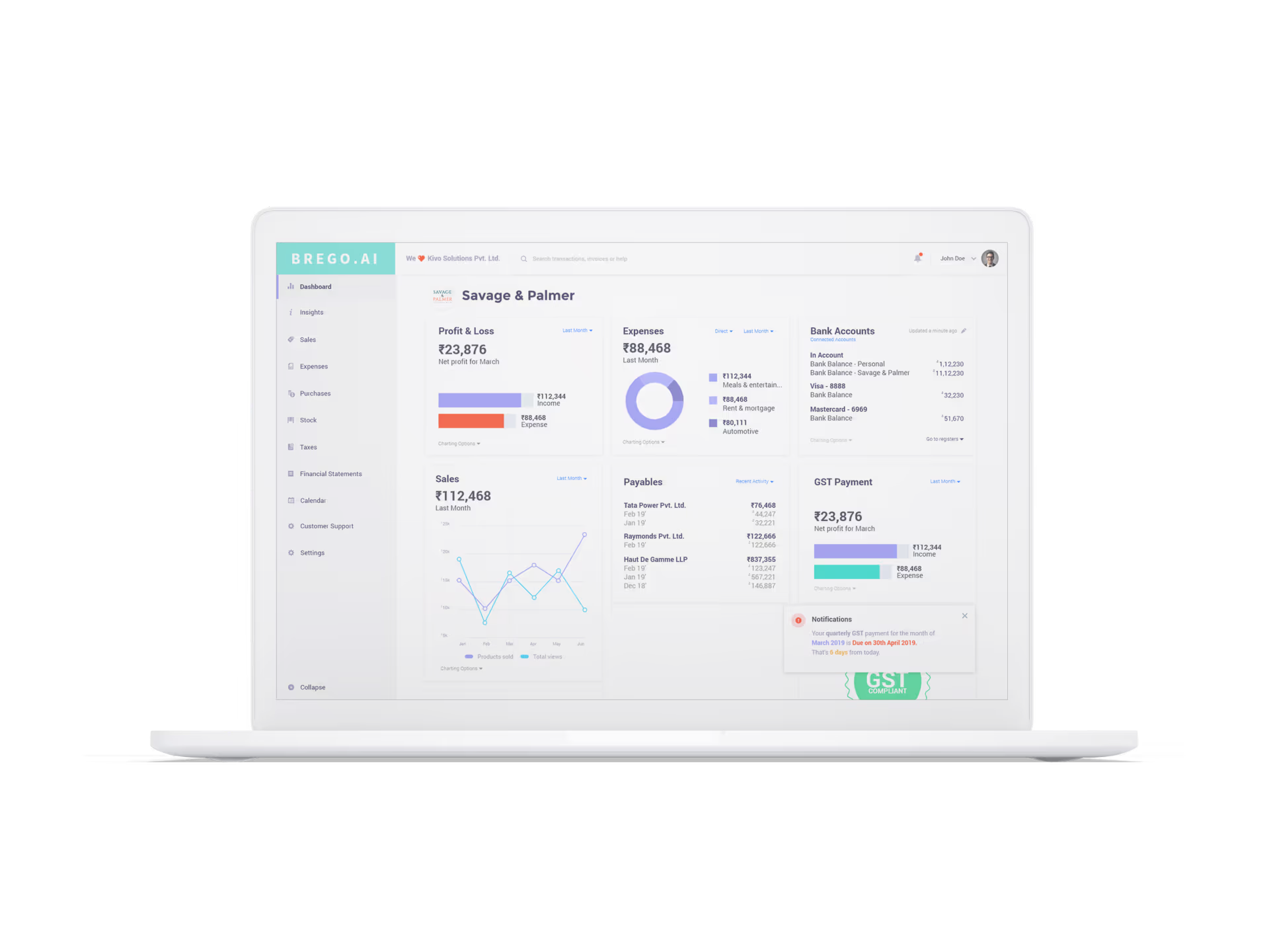


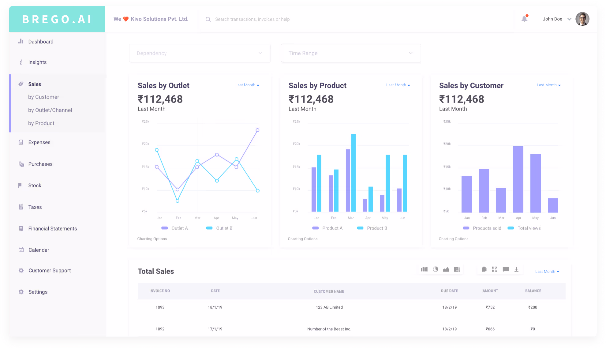
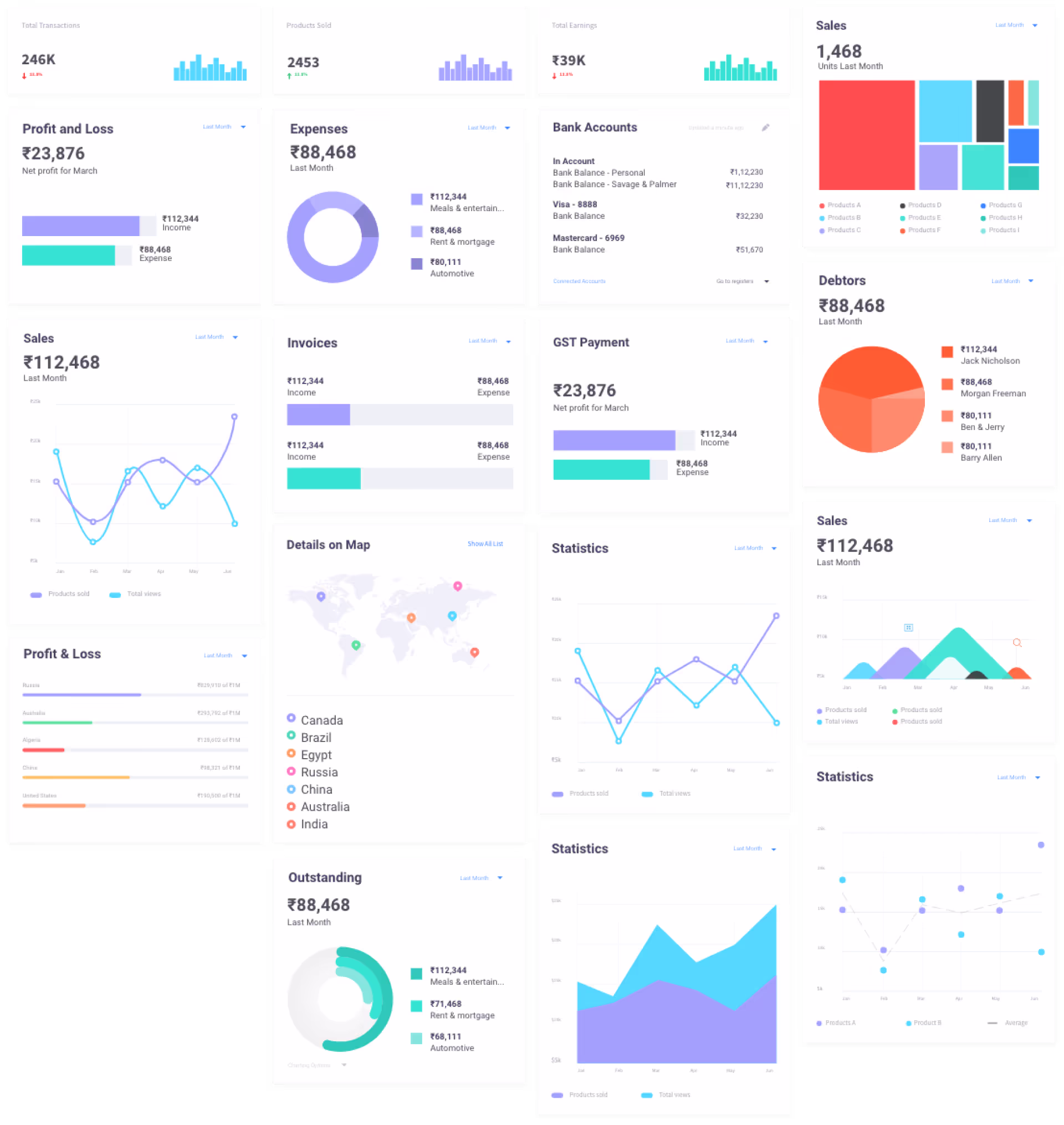
Dashboard
A snapshot view of all relevant information presented on cards. It was designed to behave like a financial Swiss Army knife. The dashboard comes preloaded with a default layout represented in the form of cards, which the user can edit, add, or rearrange.
Modular Elements
I designed a range of different quick-view items to translate various types of data into different charts and visualization elements. Some of the card items included Profit & Loss Summary, Expenses Summary, Sales Summary, Liquidity Summary, Taxes, Debtors & Creditors, etc.
Typography & Colors
Since this is an entirely digital product, I selected a sans-serif typeface combination to ensure a clean and consistent appearance—Montserrat for headings and Roboto for the rest of the text on the UI. The colors were chosen to be approachable, with pastel tones offering a smoother visual experience. The color palette included a total of five colors: three primary colors—Teal, Brick, and Lavender—and two secondary colors—Mustard and Orange.
2020 Update
After feedback from stakeholders, I added a compare button to allow users to compare data between years.
Product Design: Shivram Mahendran
